Spotify Adds ‘Verified’ Badges To Distinguish Human Artists From AI
Spotify is adding “Verified by Spotify” badges to distinguish human artists from AI-generated personas, using signals like linked social accounts, consistent listener activity, merchandise, and concert dates. The BBC reports: The world’s most-used music streaming service said the ‘Verified by Spotify’ text and green checkmark icon wo … ⌘ Read more
The Bloomberg Terminal Is Getting an AI Makeover, Like It or Not
WIRED spoke with Bloomberg’s chief technology officer about the big, chatbot-style changes coming to the iconic platform for traders. ⌘ Read more
Security updates for Friday
Security updates have been issued by AlmaLinux (.NET 8.0, .NET 9.0, freerdp, libarchive, and thunderbird), Debian (chromium, openssh, and thunderbird), Fedora (aurorae, bluedevil, breeze-gtk, buildah, cockpit, extra-cmake-modules, flatpak-kcm, grub2-breeze-theme, kactivitymanagerd, kcm_wacomtablet, kde-cli-tools, kde-gtk-config, kdecoration, kdeplasma-addons, kf6, kf6-attica, kf6-baloo, kf6-bluez-qt, kf6-breeze-icons, kf6-frameworkintegration, kf6-kapidox, kf6-karchive, kf6-kauth, kf6-kbookmar … ⌘ Read more
Near-death experience shapes actor’s role in new video game
Hannah Telle and Rhianna DeVries, the actors behind one of gaming’s most iconic relationships, are returning — and bringing deeply personal experiences with them.
Speaking with 9news.com.au, DeVries revealed how surviving a near-death experience shaped their performance in the upcoming game Life is Strange: Reunion. ⌘ Read more
↳
In-reply-to
»
@lyse 😂 Pretty cool remix(?)!
⤋ Read More
@bender@twtxt.net H-Blockx covered it, the original was by Snap! https://en.wikipedia.org/wiki/The_Power_(Snap!_song) But it’s actually not my type of music at all. The high pitch refrain “I’ve got the power” is iconic and has somehow burned itself into my brain. Must have been a short circuit.
‘Babylon 5’ Episodes Start Appearing (Free) on YouTube
Cord Cutters News reports:
In a move that has delighted fans of classic science fiction, Warner Bros. Discovery has begun uploading full episodes of the iconic series Babylon 5 to YouTube, providing free access to the show just as it departs from the ad-supported streaming platform Tubi… Viewers noticed notifications on Tubi indicating that all five seasons w … ⌘ Read more
Big Tech’s $1.1 Trillion Cloud Computing Backlog
An anonymous reader shares a report: Amazon, Google, and Microsoft each reported hundreds of billions in RPO (remaining performance obligations) – signed contracts for cloud computing services that can’t yet be filled and haven’t yet hit the books. Collectively, the big three cloud providers reported a $1.1 trillion backlog of revenue.
[
[ C++23 core language and standard library implementations.
[
](http://twitter.com/home?status=Visual+Studio+2026+Released%3A+ … ⌘ Read moreHow to Make Icons Clear in iOS 26 for iPhone & iPad
The Liquid Glass interface of iOS 26 makes everything more transparent, and you can bring that effect to your Home Screen icons too by making them clear. The clear icon look offers a dramatic visual change to the icons on your iPhone or iPad, stripping them of the usual bright neon colors and transforming them … Read More ⌘ Read more
Deals: AirPods 4 from $85
AirPods 4 feature the iconic earbud design, and have many great features like gesture support, spatial audio, voice isolation, water and sweat resistance, Siri support, and USB-C charging. Get AirPods 4 for $85 (down 30% from $129) Apple Watch Series 10 from $279 You can get Apple Watch Series 10 for $279 at $120 off, … Read More ⌘ Read more
Iconic Andean monument may have been used for Indigenous accounting
Sediment analysis and drone photography of the iconic South American monument of Monte Sierpe (aka “Band of Holes”) support a new interpretation of this mysterious landscape feature as part of an Indigenous system of accounting and exchange. ⌘ Read more
macOS Tahoe’s Terrible Icons
An anonymous reader shares a report: On the new MacOS 26 (Tahoe), Apple has mandated that all application icons fit into their prescribed squircle. No longer can icons have distinct shapes, nor even any fun frame-breaking accessories. Should an icon be so foolish as to try to have a bit of personality, it will find itself stuffed into a dingy gray icon jail.
[…] While Apple had previously urged developers to use … ⌘ Read more
MacOS 26’s new icons are a step backwards
On the new MacOS 26 (Tahoe), Apple has mandated that all application icons fit into their prescribed squircle. No longer can icons have distinct shapes, nor even any fun frame-breaking accessories. Should an icon be so foolish as to try to have a bit of personality, it will find itself stuffed into a dingy gray icon jail. ↫ Paul Kafasis The downgraded icons listed in this article are just… Sad. While there’s no accounting for tastes, Apple’s new gla … ⌘ Read more
Design trends I think will take off in 2026
but tierlist

S - move from flat design to more detailed, 3D, more complex logos.
A - glass, not just liquid, Windows Vista, 7, 11,… accessibility concerns, but I like to see it.
B-/C+ - black and white icons, favicons. I did it before it was cool, but it’s getting overused.
E - gradientslop, barely started, already all blends together.
What about the icons in pifmgr.dll?
Raymond Chen has another great post about some of the classic icons from Windows 95, this time focusing on pifmgr.dll. In this file, there are a variety of random-seeming icons, and it turns out they’re random for a reason: they were just a bunch a fun, generic icons intended for people to use when creating PIF files. The icons in pifmgr.dll were created just for fun. They were not created with any particular programs in mind, with one obvious exception. They w … ⌘ Read more
How to Show Battery Percent in Menu Bar of macOS Tahoe
Knowing the percentage remaining of your MacBook battery life is valuable information for many Mac laptop users who work on the go or away from a power source, and a simple way to always know where your battery stands is to adjust the Mac battery menu icon to show the battery percentage remaining. This article … Read More ⌘ Read more
Vim icon ⌘ Read more
iOS 26.0.1 Update Released to Fix Various iPhone 17 Issues, & Blank Screen Icons
Apple has released the first update for iOS 26.0.1, which includes a handful of bug fixes specifically aimed at the new iPhone 17 lineup, as well as addressing an issue for all devices where Home Screen icons can appear blank after using various Liquid Glass customization settings, and another issue where VoiceOver might disable itself … [Read More](https://osxdaily.com/2 … ⌘ Read more
10 Crazy-Specific Rules Dallas Cowboys Cheerleaders Must Follow
Being a Dallas Cowboys cheerleader is one of the most high-profile off-field jobs in all of professional sports. The iconic uniforms, the backing of one of the most followed NFL teams in the country, and the throngs of cheering fans at games and events all make it so. The Cowboys’ cheerleaders are undoubtedly the most […]
The post [10 Crazy-Specific Rules Dallas Cowboys Cheerleaders Must Follow](https://l … ⌘ Read more
We use all the Microsoft programs at work - Teams and Outlook especially.
After all kinds of technical problems with Teams, that sometimes go unresolved for over a year, Microsoft shifted their priorities away from fixing things and towards adding an annoying AI Copilot button, that just takes up space and all it does, is loads the website in Teams, so I disabled it. Soon they just add it back, but in a different row of icons, therefore it’s now a different button, you have to disable (I think they added yet another one, to the Teams, on my work phone and I had to disabled that too). Not too long after, the desktop one just enabled itself, because of “an error” and I can disable it, but doing so activates a popup, that begs you to turn it back on, every once in a while. You can’t disable the popup and can only click “Yes” or “Not now” on it. I still keep it disabled, out of principle, but yesterday I noticed yet another Copilot button, this time in the top right corner of my Outlook and this one cannot be disabled, on the business version of Outlook and even on the personal one, it’s only possible to do it through hidden privacy settings, by prohibiting the program from connecting to Microsoft servers, for extra “features”.
There’s people complaining about it online, so it’s clear nobody really wants it, but at this point Microsofts position is that you will have at least one useless AI button on your screen, at any given time, and you will be happy. And yes, their AI sucks and if I absolutely have to use AI for something, there’s already 2 better options, we have access to, at work.
↳
In-reply-to
»
After around 3 years, I managed to make my "smallest recognizable canine", even smaller. So here's the all new, smallest recognizable canine 2.0:
Media
⤋ Read More
@thecanine@twtxt.net Wow. I’m not an artist in any way, but I have tried to make icons for programs or fonts every now and then. Making something that is still recognizable at so few pixels is hard. Hats off!
The Bus Stop Military-Industrial Complex
There’s something deeply unsettling about seeing defence contractors advertise on London buses like they’re selling meal delivery kits or productivity apps. Last week I was visiting London, England where I noticed an advertisement on one of London’s iconic red buses. Anduril—named after Aragorn’s sword in Lord of the Rings, because apparently nothing says “serious defence […] ⌘ Read more
↳
In-reply-to
»
la di da da di da da di da da di daaaaa https://www.youtube.com/watch?v=jeI992mvlEY
⤋ Read More
@lyse@lyse.isobeef.org BLUE DA BA DI BA DI DAAAA hahah iconic!!! ladida is suchhh a good song i was so obsessed with it when it came out in 2020
omg new @bender@twtxt.net icon!!!!
↳
In-reply-to
»
I was drafting support for showing “application icons” in my window manager, i.e. the Firefox icon in the titlebar:
⤋ Read More
@lyse@lyse.isobeef.org “Advanced”, well, probably more “mature”. There aren’t a ton of crazy features and that icon thing is the largest code addition in the last 10 years. %)
Speaking of OS/2 … I just realized that Windows 3.x didn’t have icons, either. If I’m not mistaken, this only got added in Windows 95. In other words, OS/2 had this feature before Windows did, because at least OS/2 2.1 from 1993 had icons. Who would have thunk.
(Now I kind of want to know which system really introduced this feature.)
↳
In-reply-to
»
I was drafting support for showing “application icons” in my window manager, i.e. the Firefox icon in the titlebar:
⤋ Read More
@lyse@lyse.isobeef.org Oh, huh, maybe it was just my GNOME 2 themes back then that didn’t show the icon. 🤔
I like the looks of your window manager. That’s using Wayland, right?
Oh, no. It’s still X11. All my recent Wayland comments resulted from me trying to switch, but I think it’s still too early. Being unable to use QEMU (because it can’t capture the mouse pointer) is a pretty big blocker for me. This is completely broken, it just happens to be unnoticeable with modern guest OSes, so it’s probably not a priority for devs.
(Not to mention that I would have to fork and substantially extend dwl in order to “replicate” my X11 WM. And then, after having done that, I’d have to follow upstream Wayland development, for which I don’t have the resources. Things would need to slow down before I can do that.)
all that wasted space of the windows not making use of the full screen!!!1
Heh. I’ve been using tiling WMs for ~15 years now, so it’s actually kind of refreshing to see something different for a change. 😅
Probably close to the older Windowses.
That particular theme is a ripoff of OS/2 Warp 3: 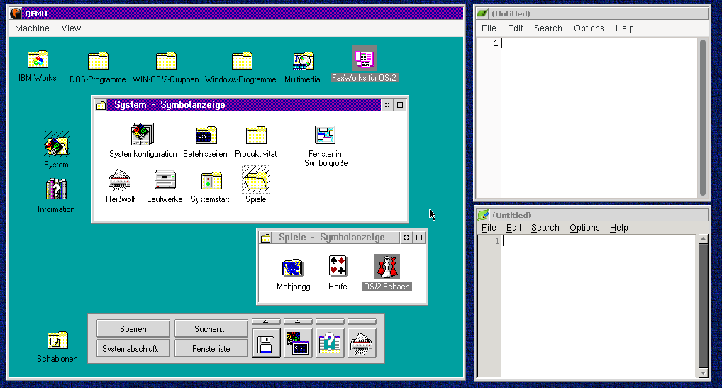 😅
😅
We ran some similar brownish color scheme (don’t recall its name) on Win95 or Win98
Oh god. Yeah, I wasn’t a fan of those, either. 🥴