Happy Summer Solstice and/or Father’s Day, to those who celebrate.
I spent mine setting up a gift from my wife, a Govee TV Backlight 3 Lite, and then watching a couple of movies that really brought the colors out: Flash Gordon (1980) and Dune (2021) (with Rifftrax commentary).
I’d call that a good day.
The dairy farm has a new milk vending machine. The prices increased by 20%. One liter is now 1.20€ instead of 1.00€. But I don’t complain.
In a few meters of shrubs there were easily 50 butterflies. That was crazy, I’ve never seen this many in one spot. I should have taken a video.
The grain field in the beginning was looking so great. Crazy colorful and very yummy looking. I would have loved to take a bite. Or at least lie down right in the middle.
That was another great time in the outdoors. The 21°C were killing us, though. We were always glad when we reached a shady spot with a little breeze. I’m not gonna survive the 35°C later this week. :-(
↳
In-reply-to
»
Every now and then, I think that I have carefully proof-read my message enough times and hit the "Add message" button in
⤋ Read More
tt. But then, in the message tree, I spot another missed typo. My process is then to go to my twtxt.txt and fix it by hand. However, I still have to clean up tt's cache. This is rather tidious:
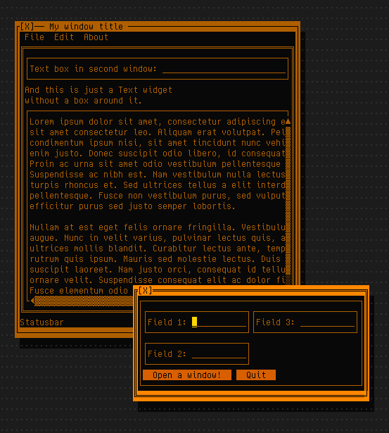
With multicolored TUIs, I find it usually hard to immediately tell which button is selected if there are just two.
Indeed, I wouldn’t be able to tell in that example, either. movwin works around that by (mostly) assuming that there is no support for colors at all, so there should always be a way to tell which widget has focus, even without colors. That’s why it puts brackets around a button’s label when focused:


The fewer colors you use, the better, I guess. 🤔
Connections Help, Hints & Clues for Today, June 8
Connections for June 8 is now live on the NYT application and website. Essentially, this exciting game presents 16 words each day for players to sort into four different groups. Moreover, each group follows a unique theme. Additionally, the game occasionally incorporates wordplay, such as palindromes or homophones, to add a layer of challenge. Furthermore, a specific color marks each category based on its difficulty … ⌘ Read more
James Gunn Sets the Record Straight on Supergirl’s F-Bombs Report
James Gunn has addressed rumors concerning the use of expletive language in Supergirl. After reports emerged suggesting the upcoming DC Universe film would include the F-word, the filmmaker and DC Studios co-head publicly responded to the speculation. Gunn’s comments have sparked widespread discussion about the language that would appear in the upcoming film. James Gunn […]
The post [James Gunn Sets the Rec … ⌘ Read more
↳
In-reply-to
»
@movq It's the "Lyse types the entire HTML by hand" generator. Yes, no kidding. I write articles so rarely, that I can do that once in a while. It's fun to some degree, but also not.
⤋ Read More
Years ago, I used Kate, no, not somebody’s wife, but the KDE Advanced Text Editor, to export source code files and fragments into HTML with syntax highlighting. I think that’s where I got the initial <b> idea from. There were also bucketloads of <span style='color:#644a9b;'> all over the place, even inside <b>. No CSS classes defined upfront, all colors inlined. The final rendering in the browser looked great, but the source code ugly as hell in my opinion. However, I’m thankful for hinting me at <b>. I think this kicked off everything. :-)
Love the color of my new bikini ⌘ Read more
One and a half weeks ago, our sunset delivered strong colors: https://lyse.isobeef.org/abendhimmel-2026-05-21/ Apologies for the damn fuzz in the optics.
Intel To Support DRM Background Color Property With Linux 7.2
Introduced in Linux 7.1 is a dedicated CRTC background color property for DRM graphics/display drivers. The “BACKGROUND_COLOR” property can be used with capable drivers and display controllers as the default background color when not covered by any plane or from transparent regions of higher planes. With the upcoming Linux 7.2 kernel cycle, the Intel DRM driver will begin supporting this background color property… ⌘ Read more
NVIDIA 610.43.02 Linux Driver Released With Vulkan Improvements, DRM Color Pipeline API
NVIDIA is kicking off the new week with their first Linux driver beta in the R610 driver series that is succeeding the current R595 release branch… ⌘ Read more
Mustard Made Storage Lockers Are on a Rare Sale Through May 31
We love this brand’s stylish storage lockers, and there’s a big sale on eight colors through the end of the month. ⌘ Read more
AI Promised the Audemars Piguet x Swatch Wristwatch. China Will Deliver It
Watch fans spent a week falling in love with colorful Royal Oak wristwatches that didn’t exist—then the real thing arrived. Now, fantasy is becoming a manufacturing opportunity. ⌘ Read more
Epson Lifestudio Grand Plus Review: Rich Colors, Gemini Support
The Lifestudio Grand Plus isn’t without quirks, but the ultrashort-throw home cinema projector delivers a rich picture quality in movies and games, up to a 150-inch screen size. ⌘ Read more
How Microplastics Are Likely Helping To Heat Up the Planet
A new Nature Climate Change study suggests airborne microplastics – especially darker and colored particles – are likely contributing to atmospheric warming by absorbing more heat than they reflect. Researchers estimate the effect could be roughly one-sixth that of black carbon, though outside experts say the uncertainties remain large and more study is ne … ⌘ Read more
Wayland Developers Target June For Weston 16 Release
Weston 16.0 could ship by the end of June with good color management and HDR support along with other new features for this reference Wayland compositor… ⌘ Read more
Amazon’s Kindle Colorsoft Gets a Dark Mode (2026)
Amazon’s color e-reader finally gets a dark mode. ⌘ Read more
BMW Is One Step Closer To Selling You a Color-Changing Car
BMW’s latest concept car moves the color-changing tech it debuted back at CES 2022 closer to reality by embedding an E Ink panel directly into the hood. The Verge reports: BMW’s previous concepts wrapped the entire vehicle in a patchwork of E Ink panels that were all custom-sized and shaped to match its contours. It was an approach that wasn’t practical for … ⌘ Read more
My mate and I hiked some 16-18 kilometers to the Wasserberg. The 22°C sun was beating down hard on us. There were quite a bunch of clouds all around, but none of them casted the tiniest shade on us. Only in the second half we got a little bit luckier in that regard. Still, we were soaked before we even left town. Hardly any breeze.
Unfortunately, I left my camera at home and found it hidden behind the cettle in the kitchen after searching the entire house for some 15 odd minutes. However, a greenfinch paid me a visit this morning and I got it on camera. The sunset was crazy colored, too:
↳
In-reply-to
»
The weathermen just cannot be right with their 20°C today, it must have been more. It was awfully hot, the light breeze was not enough and even absent most of the time. In the shade, it was alright. Other than that, the walk to the dairy farm and back was really beautiful. Very lovely scenery.
⤋ Read More
@lyse@lyse.isobeef.org Those are some very colorful shots. 👌 It was pretty warm here as well, health issues prevented me from going out, though.
(Have we established that Azabache is male? 😃)
NVIDIA Provides Preview Driver With DRM Color Pipeline API Support
Following the DRM Color Pipeline API making it into the Linux 6.19 kernel, NVIDIA today released a preview Linux driver with their support for the DRM per-plane color pipeline API that will benefit the broader Linux/Wayland desktop HDR ambitions… ⌘ Read more
↳
In-reply-to
»
@lyse Thanks for the heads-up.
⤋ Read More
@itsericwoordward@itsericwoodward.com @bender@twtxt.net Well, even hard-reloading doesn’t change anything. I also just noticed that hovering over the tab title makes it completely invisible. In contrast to the buttons, here, the text color is exactly the same as the background color:

Since I prefer the light theme, that’s no big deal for me. 8-)
↳
In-reply-to
»
@lyse Thanks for the heads-up.
⤋ Read More
@lyse@lyse.isobeef.org Thanks (again) for the heads-up!. I’m not sure why you were seeing black text, but I just pushed a new version of the library (v0.10.1) with some updated colors in the demo’s themes (which should hopefully address the contrast issues).
The dark mode was an aesthetic choice by a designer with a strong preference for dark mode (and who thought the maroon looked better as a background color), but in the interest of being supportive of my audience, I added a localstorage-backed memory to the theme toggle (so when you turn it to light mode, it should remember for future visits).
↳
In-reply-to
»
@lyse Thanks for the heads-up.
⤋ Read More
@itsericwoordward@itsericwoodward.com Nice. I just wanted to let you know that the black text color on nearly black button background color in the twtHash tab is basically unreadable. I’ve no idea why the dark theme is preferred over the light one in my browser anyway. :-D
wlroots 0.20 Released,Sway 1.12-rc1 Available For Testing With Color Management
Released today was wlroots 0.20 as this Wayland support library used by some Wayland compositors for doing much of the “heavy lifting” of compositor bring-up. Following wlroots 0.20, Sway 1.12-rc1 was released for testing as this closely-aligned Wayland compositor inspired by the i3 window manager… ⌘ Read more
↳
In-reply-to
»
Now that Winter has come to an end, I’m realizing that the default amber color scheme of my widget toolkit might be problemaic.
⤋ Read More
There you go, user-defined color schemes:

Linux 7.1 Adding DRM Dedicated CRTC Background Color Property
Sent out today was the latest weekly round of drm-misc-next patches for queuing ahead of the Linux 7.1 merge window that is set to happen in mid-to-late April… ⌘ Read more
Wayland 1.25 Released With Color Management Now Fully Documented
Simon Ser just released Wayland 1.25… ⌘ Read more
Court Rules TCL’s ‘QLED’ TVs Aren’t Truly QLED
A German court ruled that TCL misled consumers by marketing certain TVs as “QLED” when they “do not deliver the color reproduction expected from QLED TVs.” It has ordered the company to stop advertising or selling those models in Germany. TechRadar reports: The case was filed by Samsung, which claimed that TCL was running deceptive advertising, and more court cases on the same topic are … ⌘ Read more
AMD HDR/Color Improvement For Their Linux Driver & KDE - Co-Developed By Claude Code
Introduced with Linux 6.19 was the long in development DRM Color Pipeline API while it’s not the end of the road yet on enhancing the Linux desktop for modern high dynamic range (HDR) displays and color pipeline handling. AMD engineer Harry Wentland has more improvements pending for the AMDGPU driver as well as example compositor/desktop-side integration with KDE’s KWin… ⌘ Read more
Now that Winter has come to an end, I’m realizing that the default amber color scheme of my widget toolkit might be problemaic.

Readability isn’t great when the sun is blasting through the windows. 🥴
I should probably make this full themeable by the user …
(Haven’t worked on this code in a month, sadly.)
Mozilla Is Working On a Big Firefox Redesign
darwinmac writes: Mozilla is working on a huge redesign for its Firefox browser, codenamed “Nova,” which will bring pastel gradients, a refreshed new tab page, floating “island” UI elements, and more. “From the mockups, it appears Mozilla took some inspiration from Googles Material You (or at least, the dynamic color extraction part of it) because the browser color accent appears influ … ⌘ Read more
↳
In-reply-to
»
So, this happened this morning:
⤋ Read More
@bender@twtxt.net I see. Other shot is also quite colorful.
The Government Just Made it Harder to See What Spy Tech it Buys
An anonymous reader shares a report: It might look like something from the early days of the internet, with its aggressively grey color scheme and rectangles nested inside rectangles, but FPDS.gov is one of the most important resources for keeping tabs on what powerful spying tools U.S. government agencies are buying. It includes everything from pho … ⌘ Read more
GNOME 50 Lands Updated Wayland Color Management v2 Support
Following GNOME 50’s Mutter merging sdr-native color mode support for wide color gamut displays this week, another late addition to Mutter has now been merged ahead of next month’s GNOME 50 stable release… ⌘ Read more
Dell UltraSharp U5223KW: An Outstanding 52-Inch 6K Monitor With Extensive Connectivity
Earlier this month Dell sent over a review sample of their new UltraSharp U5223KW monitor. While the model number may not imply much, this monitor is outright incredible. The Dell UltraSharp U5223KW is a 52-inch 6K @ 120Hz monitor with integrated USB hub also working as a KVM switch, 140 Watt power delivery support for USB-C/Thunderbolt laptops, 2.5G Ethernet, and the color reproduction and visuals with this Dell 6K monitor ar … ⌘ Read more
GNOME 50 Merges “sdr-native” Color Mode Support For Wide Color Gamut Displays
As a late stage change for GNOME 50 ahead of its official debut next month and following last week’s GNOME 50 beta is plumbing the Mutter compositor for a new “sdr-native” color mode option… ⌘ Read more
Linux 6.19 Released With Better Support For Older AMD GPUs, DRM Color Pipeline API
As anticipated due to the extra week for the cycle given end of year holidays, Linus Torvalds today released the Linux 6.19 stable kernel as the first major release of 2026. There is a lot in store with this early 2026 kernel release… ⌘ Read more
Krita 6.0 Beta Released - Using Qt6 & Wayland Color Management Support
The first beta release of Krita 6.0 is now available for this featureful digital painting program. Krita 6.0 is re-based against the Qt6 toolkit while Krita 5.3 Beta is also being released at the same time for those sticking to Qt5… ⌘ Read more
A few minutes of nice colors in the sky: https://lyse.isobeef.org/abendhimmel-2026-02-04/
@klaxzy@klaxzy.net Haha, I just noticed because my client colors mentions differently depending on whether I follow the feed or not. ;-)
Omg, Python. Parsing arguments with argparse takes 50 ms on my NUC, because this pulls in all kinds of fancy stuff behind the scenes, colorization and what not. 😮💨
Google Temporarily Disabled YouTube’s Advanced Captions Without Warning
Google has temporarily disabled YouTube’s advanced SRV3 caption format after discovering the feature was causing playback errors for some users, according to a statement the company posted. SRV3, also known as YouTube Timed Text, is a custom subtitle system Google introduced around 2018 that allows creators to use custom colors, tran … ⌘ Read more
Ultimate Camouflage Tech Mimics Octopus In Scientific First
Researchers at Stanford University have created a programmable synthetic “skin” that can independently change color and texture, “a feat previously only available within the animal kingdom,” reports the Register. From the report: The technique employs electron beams to write patterns and add optical layers that create color effects. When exposed to wate … ⌘ Read more
I think my widget toolkit will have an amber theme by default:
My first PC had a monochrome amber screen and I just love looking at this. 😃
(It looks even better with redshift enabled, but I can’t screenshot that.)
Only downside is that there aren’t that many amber shades in the standard 256 color palette. Or well, maybe that’s actually a good thing, as it probably helps to keep the theme more minimal and less cluttered/noisy. 🤔
DRM Splash Screen Updated To Simply Drawing A Colored Background, Displaying A BMP Image
Back in October was an initial proposal for a DRM splash screen client for the Linux kernel that would be primarily useful for embedded systems for rendering a simple “splash screen” when updating the system firmware/software, early display activation at boot, during system recovery, or similar processes. Sent out today was a second revision to the DRM splash screen code… ⌘ Read more
Trump Organization’s $499 Smartphone Delayed Again, Now Until the End of January
Last June the Trump organization announced sales of a $499 “T1” smartphone with a gold-colored case. But though they originally were scheduled for release in August, this week a customer service representative for the wireless carrier told CBS News the device will be pushed back again, now until the end of January, “ … ⌘ Read more
↳
In-reply-to
»
On my way to having windows and mouse support:
⤋ Read More
At around 19 seconds in the video, you can see some minor graphical glitches.
Text mode applications in Unix terminals are such a mess. It’s a miracle that this works at all.
In the old DOS days, you could get text (and colors) on the screen just by writing to memory, because the VGA memory was mapped to a fixed address. We don’t have that model anymore. To write a character to a certain position, you have to send an escape sequence to move the cursor to that position, then more escape sequences to set the color/attributes, then more escape sequences to get the cursor to where you actually want it. And then of course UTF-8 on top, i.e. you have no idea what the terminal will actually do when you send it a “🙂”.
Mouse events work by the terminal sending escape sequences to you (https://www.xfree86.org/current/ctlseqs.html#Mouse%20Tracking).
ncurses does an amazing job here. It’s fast (by having off-screen buffers and tracking changes, so it rarely has to actually send full screen updates to the terminal) and reliable and works across terminals. Without the terminfo database that keeps track of which terminal supports/requires which escape sequences, we’d be lost.
But gosh, what a mess this is under the hood … Makes you really miss memory mapped VGA and mouse drivers.
↳
In-reply-to
»
@lyse You actually have a Markdown parser/renderer in there? Oh dear. I would have been (well, I am) way too lazy for that. 😅
⤋ Read More
@movq@www.uninformativ.de Well, just a very limited subset thereof:
- inline and multiline code blocks using single/double/triple backticks (but no code blocks with just indentation)
- markdown links using using
[text](url)
- markdown media links using

And that’s it. No bold, italics, lists, quotes, headlines, etc.
Just like mentions, plain URLs, markdown links and markdown media URLs are highlighted and available in the URLs View. They’re also colored differently, similarly to code segments.
I definitely should write some documentation and provide screenshots.
Hurray, I finally fixed another rendering bug in tt that was bugging me for a long time. Previously, when there were empty lines in a markdown multiline code block, the background color of the code block had not been used for the empty lines. So, this then looked as if there were actually several code blocks instead of a single one.
![]()
Shotcut 25.12 Released With 10-bit Video CPU Pipeline, Linear Color Processing
December happens to be a busy month for video editor releases in the open-source world. This month there’s been the release of Flowblade 2.24, OpenShot 3.4, Kdenlive 25.12, and now there is Shotcut 25.12 before closing out the month and year… ⌘ Read more