Been digging Susam Pal’s Wander Console: https://susam.net/wander/
I like the way it combines human curation with algorithmic randomness, allowing you to visit other #smolweb sites without leaving “home”.
Like this one - The Oldschool PC Font Resource: https://int10h.org/oldschool-pc-fonts/fontlist/
I plan on adding one to my own site as part of its next update.
Adobe Adds Its AI Assistant To Premiere, Illustrator and InDesign
Adobe is expanding its Firefly AI assistant into Premiere, Illustrator, InDesign, and Frame.io, where it can automate all sorts of tasks such as organizing clips, renaming assets, adding interview markers, rearranging layers, and finding missing fonts. It’s available starting today as part of a public beta. TechCrunch reports: Adobe is slowly tr … ⌘ Read more
Présidentielle: Mélenchon accélère… et le reste de la gauche bricole encore
Alors que le leader insoumis a rassemblé des milliers de personnes à Saint-Denis pour son lancement de campagne, les communistes et Les Écologistes ont passé le week-end à se compter et à tenter de s’extirper de leurs querelles d’appareil. Quand le premier déroule, les seconds font du surplace. ⌘ Read more
«C’est un énorme gâchis»: le parcours brisé des Afghans exilés en Suède
Ils n’obtiennent ni asile ni droit au séjour et font parfois le choix, au bout de dix ans, de tout recommencer en France ou en Allemagne. L’idée que des talibans puissent être reçus par la Commission européenne pour négocier leur expulsion est un nouveau coup dur pour les jeunes Afghans. ⌘ Read more
L’affaire de la jeune Lyhanna révèle une crise de la justice et des services d’enquête
Des dysfonctionnements se font jour au parquet et dans la gendarmerie, mais ils s’inscrivent dans un contexte d’engorgement des services d’enquête et de dispersion des priorités de politique pénale et d’action publique. ⌘ Read more
AI Has Come for Serif Fonts
AI companies are using serif to project humanity. Critics are calling it “tasteslop.” ⌘ Read more
Finale de la Ligue des champions: les méthodes violentes des forces de l’ordre en question
Des premiers témoignages recueillis par «Mediapart» font état de violences et d’intimidations commises par des policiers déployés en région parisienne pour «sécuriser» les célébrations de la victoire du PSG, dans la nuit du 30 au 31 mai. ⌘ Read more
Procès de la loge Athanor: tous coupables, aucun responsable
Concernant la tentative d’assassinat d’une coach en entreprise, les accusés étaient tous déjà passés aux aveux en garde à vue. Des aveux qui leur font encourir la perpétuité. Alors, à la barre, les uns reprochent aux autres de les avoir manipulés. Et réciproquement. ⌘ Read more
Pica – 免费 macOS 字体管理工具
Pica 是一款免费的 macOS 字体管理工具,专门用来整理、预览和启用字体。它支持按项目建立字体集、一键启用字体、查看 OpenType 特性,还能自动监视字体目录。@Appinn 它有个挺特别的功能:可以把自己的 Logo 放进字体预览里,直接查看不同字体在品牌设计里的实际效果。再加上颜色主题 ⌘ Read more
Entre chien et loup, les espèces se mélangent et font débat
Des canidés aux tortues en passant par les oiseaux, les espèces animales hybrides ont longtemps été perçues comme une menace pour la biodiversité. Elles pourraient au contraire abriter des combinaisons génétiques susceptibles d’accélérer l’adaptation aux bouleversements en cours. ⌘ Read more
Les travailleurs du Festival de Cannes dénoncent leur «criblage» administratif
Depuis plusieurs années, les personnes travaillant sur certains «grands événements» font l’objet d’une enquête administrative de sécurité impliquant la consultation de nombreux fichiers, dont certains renseignant leurs engagements militants. Ils et elles demandent la fin de ce ciblage politique. ⌘ Read more
taro v0.3.0: legible fonts and 9p | https://nilfm.cc/taro.html
WordPress Gets AI Assistant That Can Edit Text, Generate Images and Tweak Your Site
WordPress has started rolling out an AI assistant built into its site editor and media library that can edit and translate text, generate and edit images through Google’s Nano Banana model, and make structural changes to sites like creating new pages or swapping fonts.
Users can also invoke the assistant by taggin … ⌘ Read more
HarfBuzz 12.3 Released - Nice Performance Improvements To This Text Shaping Engine
HarfBuzz 12.3 was just released for ending out 2025 with some nice performance improvements to this widely-used text shaping engine. HarfBuzz in turn is used by the prominent Linux desktop environments, Java, Flutter, various game engines, and apps like Chrome and Firefox for text shaping needs with OpenType fonts and more… ⌘ Read more
Duas décadas. Faz hoje 20 anos - uma vida - que “Crash”, o meu segundo disco a solo, foi lançado. Um disco que fala do fim de uma vida mas também do ser partido em cacos que renasce do fim. Quase apenas coincidentemente, o disco foi gravado entre o fim da minha vida em Coimbra e o início da minha vida na “Grande Lisboa”, com tudo o que mudou com isso. O fim era o início, o disco tanto testemunho como promessa. O lançamento foi feito em Carnaxide, no meu aniversário e na noite mais longa do ano. Duas décadas - vivi uma vida inteira desde então. Há ultimamente cada vez mais coisas que acontecem ou que relembro e tenho aquele sentimento de “nem dá para acreditar que já passou tanto tempo.” Surpreendeu-me notar que o mesmo não me acontece com Crash. Não passou “demasiado tempo”, passou o tempo que tinha que passar, para que eu pudesse ter vivido a vida que vivi nos últimos vinte anos, em muitos aspectos uma “vida nova”. Crash fica assim como uma autobiografia, ou um autorretrato; uma ilustração daquilo que era #Merankorii, daquilo que era eu até então. Ouço-o hoje não com saudosismo mas com a serena convicção que fiz bem em tirar aquele retrato, lançar o registo que fiz. E talvez essa serenidade que o disco me dá também me sirva para olhar com mais vontade para os vinte anos que o futuro nos reservará.
Rubio Orders Diplomats To Return To Using Times New Roman Font
An anonymous reader quotes a report from Reuters: U.S. Secretary of State Marco Rubio on Tuesday ordered diplomats to return to using Times New Roman font in official communications, calling his predecessor Antony Blinken’s decision to adopt Calibri a “wasteful” diversity move, according to an internal department cable seen by Reuters. The department … ⌘ Read more
US State Department to revert to Times New Roman font over ‘wasteful’ Calibri
In a leaked internal cable, Secretary of State Marco Rubio calls the department’s decision to adopt Calibri in 2023 a “wasteful” diversity move. ⌘ Read more
Linux 6.19 Adds New Console Font To Better Handle Modern Laptops With HiDPI Displays
Sent in for the Linux 6.19 merge window when it comes to the frame-buffer device “FBDEV” subsystem are just a set of “fixes” for FBDEV drivers and code clean-ups. But it does also include a new console font option for better supporting modern laptops with high density displays… ⌘ Read more
Japanese Devs Face Font Licensing Dilemma as Annual Costs Increase From $380 To $20K
An anonymous reader quotes a report from GamesIndustry.biz: Japanese game makers are struggling to locate affordable commercial fonts after one of the country’s leading font licensing services raised the cost of its annual plan from around $380 to $20,500 (USD). As reported by Gamemakers and GameSpark and tra … ⌘ Read more
Blocage de Shein, exemptions pour Iliad : connivence à Choose France
Un article de Henry Bonner Le gouvernement cherche des prétextes pour un bannissement de Shein, la plateforme de e-commerce. Des entreprises du secteur du vêtement font pression pour la création de taxes, et une interdiction de ces plateformes. Cependant, le succès du e-commerce vient des avantages pour les consommateurs. Ils gagnent accès à plus de […] ⌘ Read more
I have installed font noto emoji but I can’t see them in vim ⌘ Read more
↳
In-reply-to
»
There are no really good GUI toolkits for Linux, are there?
⤋ Read More
@prologic@twtxt.net Hm, same startup delay. (Go is not an option for me anyway.)
It’s hard to tell why all this is so slow. Maybe in this particular case it has something to do with fonts: strace shows the program loading the fontconfig configs several times, and that takes up a bulk of the startup time. 🤔 (Qt6 or Java don’t do that, but they’re still slow to start up – for other reasons, apparently.)
To be fair, it’s “just” the initial program startup (with warm I/O caches). Once it’s running, it’s fine. All toolkits I’ve tried are. But I don’t want to accept such delays, not in the year 2025. 😅 Imagine every terminal window needing half a second to appear on the screen … nah, man.
I just want to use this old (bitmap?) font ⌘ Read more
↳
In-reply-to
»
@lyse Well, they say you have to build up stocks, don’t they? 😅
⤋ Read More
@movq@www.uninformativ.de Haha, right. :-D
Ah, it’s this famous font. :-) I already thought so, but wasn’t sure if it’s actually the same.
↳
In-reply-to
»
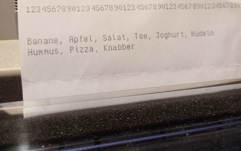
Android shopping list apps disappointed me too many times, so I went back to writing these lists by hand a while ago.
⤋ Read More
@lyse@lyse.isobeef.org Well, they say you have to build up stocks, don’t they? 😅
The font is fiamf3 (scaled up 2x, it would be too small when printed). It’s the same one that I use in my terminal and the status bars. 😃
↳
In-reply-to
»
Android shopping list apps disappointed me too many times, so I went back to writing these lists by hand a while ago.
⤋ Read More
@movq@www.uninformativ.de Wow, that’s a hell lot of food! If it doesn’t spoil, it’s easily enough for the rest of your life and all your neighbors and surrounding cities, probably more. :-D
That’s a great font. I like it. It just suits the print style incredibly well. No offence, to the absolute contrary, I would not have thought that you actually designed that. It looks just so right. Hats off! :-)
Android shopping list apps disappointed me too many times, so I went back to writing these lists by hand a while ago.
Here’s what’s more fun: Write them in Vim and then print them on the dotmatrix printer. 🥳
And, because I can, I use my own font for that, i.e. ImageMagick renders an image file and then a little tool converts that to ESC/P so I can dump it to /dev/usb/lp0.
(I have so much scrap paper from mail spam lying around that I don’t feel too bad about this. All these sheets would go straight to the bin otherwise.)
Sometimes, I wonder how my desktop looks to other people. Normal sighted people, I mean. For me, everything is much smaller and always slightly blurry (almost antialiased) because of my eyesight.
Maybe it does look horribly pixelated and super ugly to other people, and that’s why everyone prefers smoothed fonts and UIs and all that … ? 😂
Contrôle du net : tous les prétextes sont bons pour vous faire taire
Les dernières semaines offrent un véritable festival de nouvelles consternantes d’attaques portées contre les libertés fondamentales de vie privée et d’expression, ainsi qu’une volonté de faire complètement disparaître l’anonymat ou, plutôt, le pseudonymat sur internet. En effet, de plus en plus de gouvernements occidentaux font passer ou sont en train de préparer des mesures visant […] ⌘ Read more
↳
In-reply-to
»
After around 3 years, I managed to make my "smallest recognizable canine", even smaller. So here's the all new, smallest recognizable canine 2.0:
Media
⤋ Read More
@thecanine@twtxt.net Wow. I’m not an artist in any way, but I have tried to make icons for programs or fonts every now and then. Making something that is still recognizable at so few pixels is hard. Hats off!
In 1996, they came up with the X11 “SECURITY” extension:
https://www.reddit.com/r/linux/comments/4w548u/what_is_up_with_the_x11_security_extension/
This is what could have (eventually) solved the security issues that we’re currently seeing with X11. Those issues are cited as one of the reasons for switching to Wayland.
That extension never took off. The person on reddit wonders why – I think it’s simple: Containers and sandboxes weren’t a thing in 1996. It hardly mattered if X11 was “insecure”. If you could run an X11 client, you probably already had access to the machine and could just do all kinds of other nasty things.
Today, sandboxing is a thing. Today, this matters.
I’ve heard so many times that “X11 is beyond fixable, it’s hopeless.” I don’t believe that. I believe that these problems are solveable with X11 and some devs have said “yeah, we could have kept working on it”. It’s that people don’t want to do it:
Why not extend the X server?
Because for the first time we have a realistic chance of not having to do that.
https://wayland.freedesktop.org/faq.html
I’m not in a position to judge the devs. Maybe the X.Org code really is so bad that you want to run away, screaming in horror. I don’t know.
But all this was a choice. I don’t buy the argument that we never would have gotten rid of things like core fonts.
All the toolkits and programs had to be ported to Wayland. A huge, still unfinished effort. If that was an acceptable thing to do, then it would have been acceptable to make an “X12” that keeps all the good things about X11, remains compatible where feasible, eliminates the problems, and requires some clients to be adjusted. (You could have still made “X11X12” like “XWayland” for actual legacy programs.)
↳
In-reply-to
»
@movq I fully agree with you on https://www.uninformativ.de/blog/postings/2025-07-22/0/POSTING-en.html!
⤋ Read More
@lyse@lyse.isobeef.org The underlines are a bit much, yes. It appears to be related to my font (Helvetica) … Maybe they do some Unicode trickery these days, I don’t know. 🫤
↳
In-reply-to
»
Just realized: One of the reasons why I don’t like “flat UIs” is that they look broken to me. Like the program has a bug, missing pixmaps or whatever.
⤋ Read More
These are lists in your Inkscape example, right?
The font stuff? Yeah, that’s a scrollable list where you can select the current font.
How to Adjust Font Smoothing in macOS Sequoia & macOS Sonoma
Font Smoothing is a longstanding feature in MacOS that aims to make rendered screen text more legible, and it works by subtly blending the edges of display fonts with the background by using anti-aliasing. The idea is to reduce the jaggedness of screen text, but in practice nowadays it basically makes screen fonts on the … [Read More](https://osxdaily.com/2025/06/04/how-adjust-font-smoothing-macos-sequoia-sonoma-v … ⌘ Read more
↳
In-reply-to
»
hacking jetbrains mono to include CJK characters from a noto font for stupid purposes (i listen to asian music and my conky sidebar has a lastfm widget so sometimes it shows asian text and jetbrains doesn't render those. so i am frankensteining my way into making it do that)
⤋ Read More
@lyse@lyse.isobeef.org oh it wouldn’t be very long, maybe that’d make for a fun blog post! i just used the same tool that the nerd font people use to add glyphs, but for a “custom glyph set” i just added. the whole noto font LMAO
hacking jetbrains mono to include CJK characters from a noto font for stupid purposes (i listen to asian music and my conky sidebar has a lastfm widget so sometimes it shows asian text and jetbrains doesn’t render those. so i am frankensteining my way into making it do that)
Once or twice a year, I make an effort to switch from dark mode / black terminals to light mode again.
It usually doesn’t end well, because the contrast is just not as good. There’s a reason that things like professional DAWs or CAD software use a dark theme.
With a heavy bold font, it’s much better:
My font doesn’t get any bolder than this, though. I’d have to make a new variant of it. Mhh. 🤔
Anti-Piracy Video Used Pirated Music & Font
Remember that “You Wouldn’t Steal a Car” ad campaign from back in the early 2000s? ⌘ Read more
You wouldn’t steal a font
Article URL: https://fedi.rib.gay/notes/a6xqityngfubsz0f
Comments URL: https://news.ycombinator.com/item?id=43775926
Points: 516
# Comments: 151 ⌘ Read more
Un système de santé plein de (mauvaises) surprises
Tout en se gardant bien de le recopier, le monde entier nous envie notre système de sécurité sociale français. Mais si. C’est en tout cas ce qui nous est dit et seriné depuis des années. La réalité est cependant plus contrastée et ces colonnes se font parfois l’écho de ces petites bizarreries qui font tout […] ⌘ Read more
Memory safety for web fonts in Chrome: Google replaces FreeType with Rust-based alternative
There’s no escaping Rust, and the language is leaving its mark everywhere. This time around, Chrome has replaced its use of FreeType with Skrifa, a Rust-based replacement. Skrifa is written in Rust, and created as a replacement for FreeType to make font processing in Chrome secure for all our users. Skifra takes advantage of Rust’s memory safety, and … ⌘ Read more
Économistes d’universités, grands groupes, gros fonds : ces nouveaux rentiers des réglementations étouffantes
Un article de Henry Bonner La question des réglementations de l’Union Européenne met en conflit les profiteurs et les victimes des réglements et des directives. Globalement, les représentants des patrons d’entreprises font opposition aux normes de l’UE sur les déclarations d’entreprises – le CSRD et le C3SD. Les normes … ⌘ Read more
The dumb reason why flag emojis aren’t working on your site in Chrome on Windows
After doing more digging than I feel like I should have needed to, I found my answer: it appears that due to concerns about the fact that acknowledging the existence of certain countries can be perceived as a nominally political stance, Microsoft has opted to just avoid the issue altogether by not including country flag emojis in Windows’ system font. Problem solved! Can y … ⌘ Read more
La lutte contre l’anonymat sur internet continue
Il apparaît que des gens publient des choses sur internet, pas toujours tendres voire carrément méchantes, et qu’elles le font d’autant plus facilement qu’elles restent anonymes. C’est – on en conviendra aisément – parfaitement intolérable et tout doit être mis en oeuvre pour l’interdire avec la plus grande fermeté, nom d’un petit bonhomme ! Rendez-vous compte : […] ⌘ Read more
Cyrix126 releases Gupaxx v1.5.4
Cyrix1261 has released Gupaxx 2 version 1.5.43 with lots of UI improvements and various bugfixes:
[UI] Use fixed size of fonts, do not resize them
[UI] Rework Top/Bottom bar
[UI] Rework widgets/fonts
[UI] Status: human friendly display of hashrate with right metrics
[Internal] Bundle: bump version of XMRig to 6.22.2
[Internal] deprecate support for mac os 12
[Docs] improve grammar and syntax of various doc files
[Fix] when n ... ⌘ [Read more](https://monero.observer/cyrix126-releases-gupaxx-v1.5.4/)(#cispyja) @bender@bender Can you suggest a better default font size that works well on desktop and mobile? 🤔
@bender Can you suggest a better default font size that works well on desktop and mobile? 🤔 ⌘ Read more